Recurring Visual Merchandising 'Faux Pas' Creates Competitive Disadvantage for Retailers
/Nordstrom in Vancouver is good example of visual merchandising. Photo: Callison RKF
Too many retailers are allowing a lack of visual merchandising (VM) strategy to ruin the shopping experience for their customers. With the current retail revolution calling for a focus on experiential shopping, there is no room in business for such missteps.
Opportunities in correcting VM faux pas can easily go unnoticed if the retailer is oblivious to the crucial impact on sales. The most common VM faux pas threaten the brand’s image and fail to promote the merchandise, thus, impacting sales as well. Based on VM ID Inc.’s experience working with clients, these mistakes typically fall under these three areas: Presentation Standards, Visual Communication, and The VM Engine.
PRESENTATION STANDARDS
The level of standards in which a store holds itself affects the consumers’ perception of its retailer type, quality of products, and brand image. Common threats to this are visibility of outdated, damaged or inconsistent fixtures and display forms, incorrect stock amounts, unsuitable styles of merchandising, poorly displayed products, and neglecting to properly adjust lighting.
Photo: Lauren Roberts/Unsplash
Window displays, being the very face of the store, are the first preview of the product offering. Therefore, any sign of untidiness, inconsistency (think mixing mannequin types) or showing damaged items all contribute to the brand image, as perceived by the customer. Similarly, mixing in-store fixtures and hangers tarnish the impression of being a professional, established company.
Fixtures manipulate a customer’s path. If the fixtures are overcrowded and placed without a prior plan, they can block the customer’s navigation in addition to important sightlines.
If you are not a price-driven retailer, you likely do not want to be perceived as one. Overstocking fixtures communicates a lower price tag. The more negative space you allow, the higher-valued the merchandise seems. Retailers may also misrepresent themselves as outlets by using outdated fixtures, merchandising styles and signage, which are visual cues of older, traditional outlets.
Lastly, lighting sets the tone and showcases the entire space. A well-lit space increases the shoppers’ energy level as well as creates focal points for the customer’s view.
VISUAL COMMUNICATION
Having a physical selling space yet not using it for visual communication purposes is a wasted investment. Businesses who solely rely on the sales staff to educate customers on key information will lose their customers by assuming that they will ask all of the right questions.
Retailers that neglect to brand their store create a forgettable space. Consumers need to be able to get an idea of the store’s personality just by being present in its environment. This creates a lasting impression.
Without strategizing different merchandising styles through each store zone, the shopping experience will feel repetitive all the way throughout, not giving consumers a reason to further explore.
Allocating every inch of space towards actual merchandise, rather than creating visual breaks with displays or marketing, is another loss. The mentality that consumers shop purely based on the actual products is from an era long before there were endless retailers to choose from. Products do not sell themselves, nor do sales staff - the brand image and marketing play a vital role, therefore necessitating marketing tools such as display areas for further advertising. Using visual merchandising as a tool to communicate product knowledge, it is wise to portray the selling features through visual cues and presentation methods, rather than relying on the consumer to do their own research or read an abundance of text through signage.
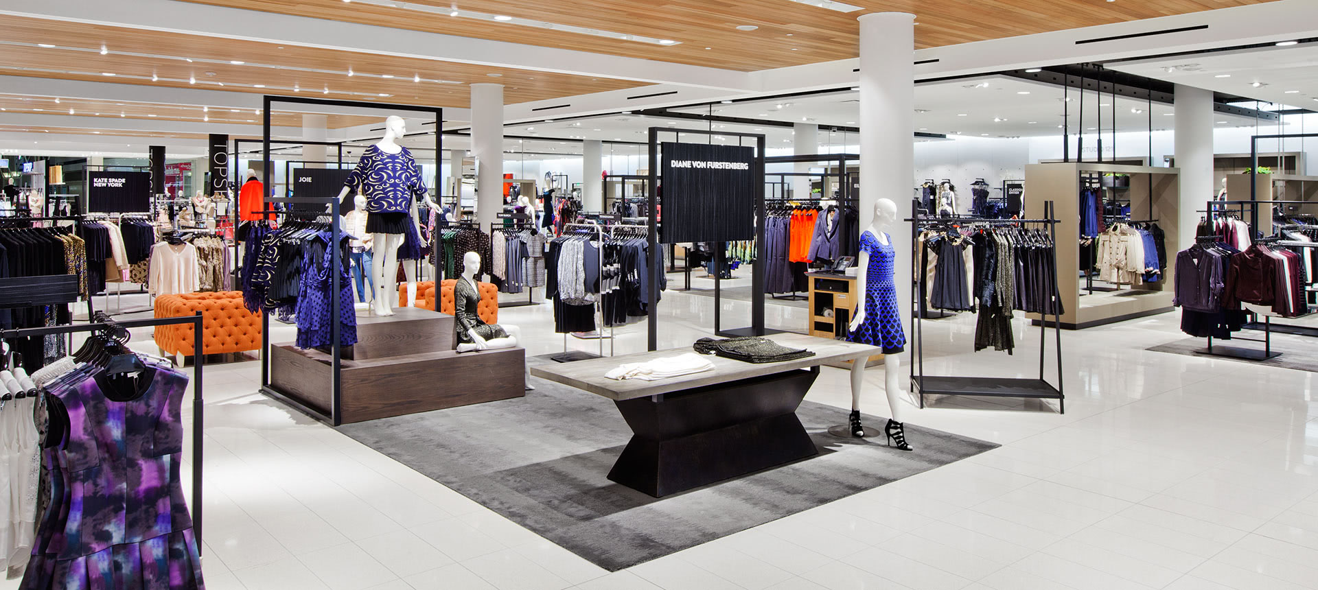
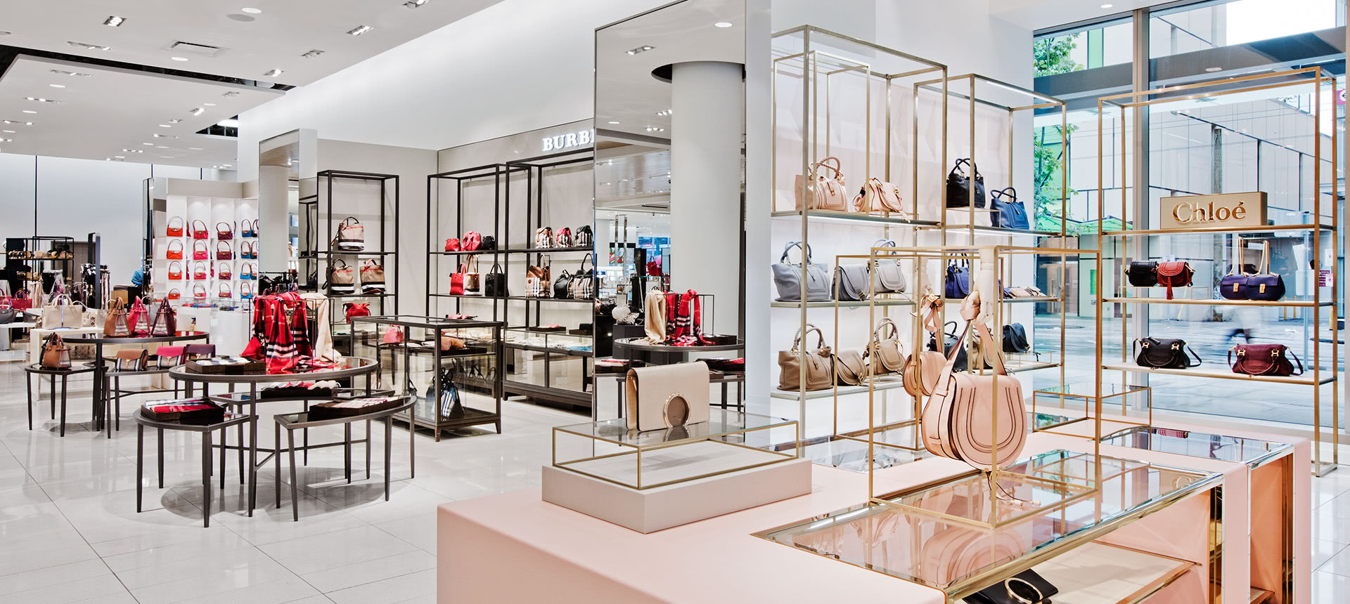
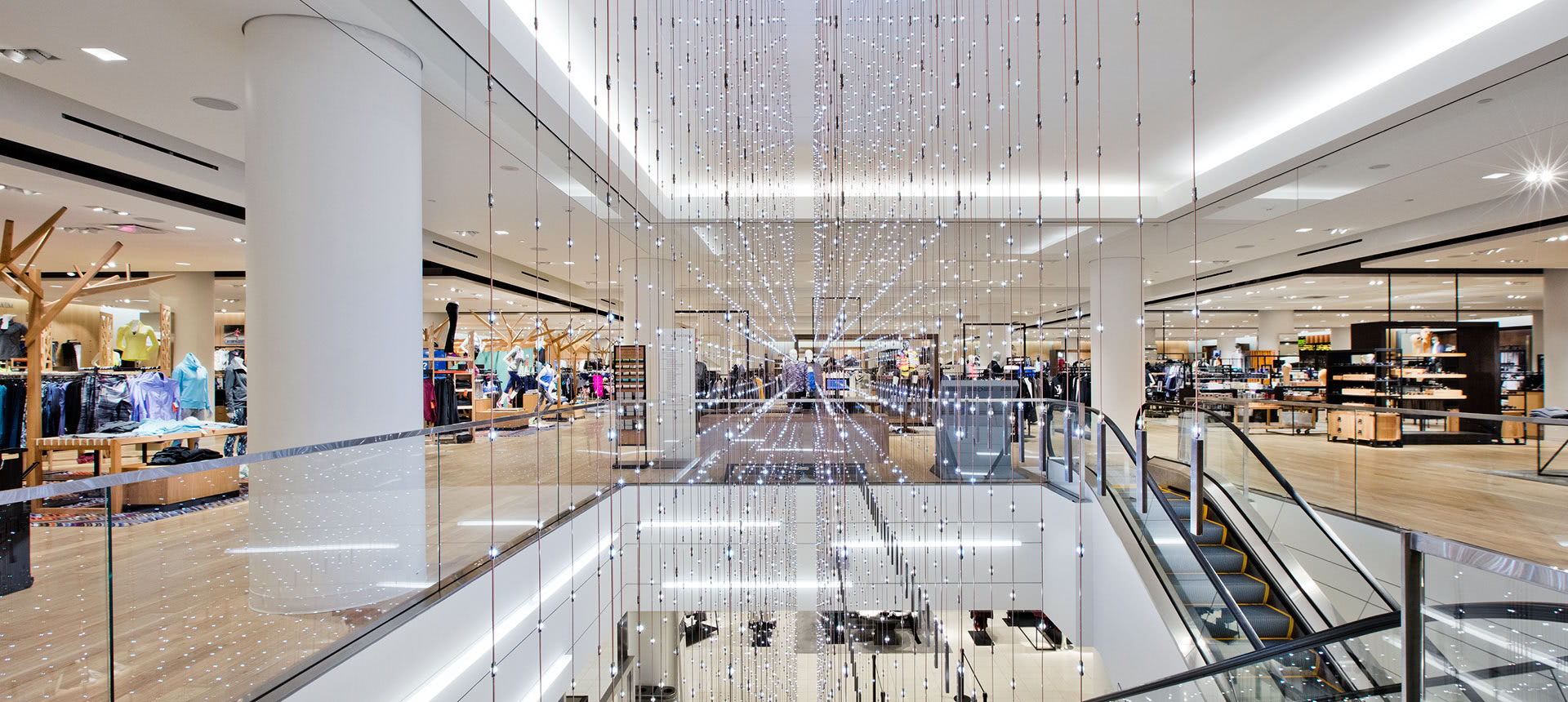
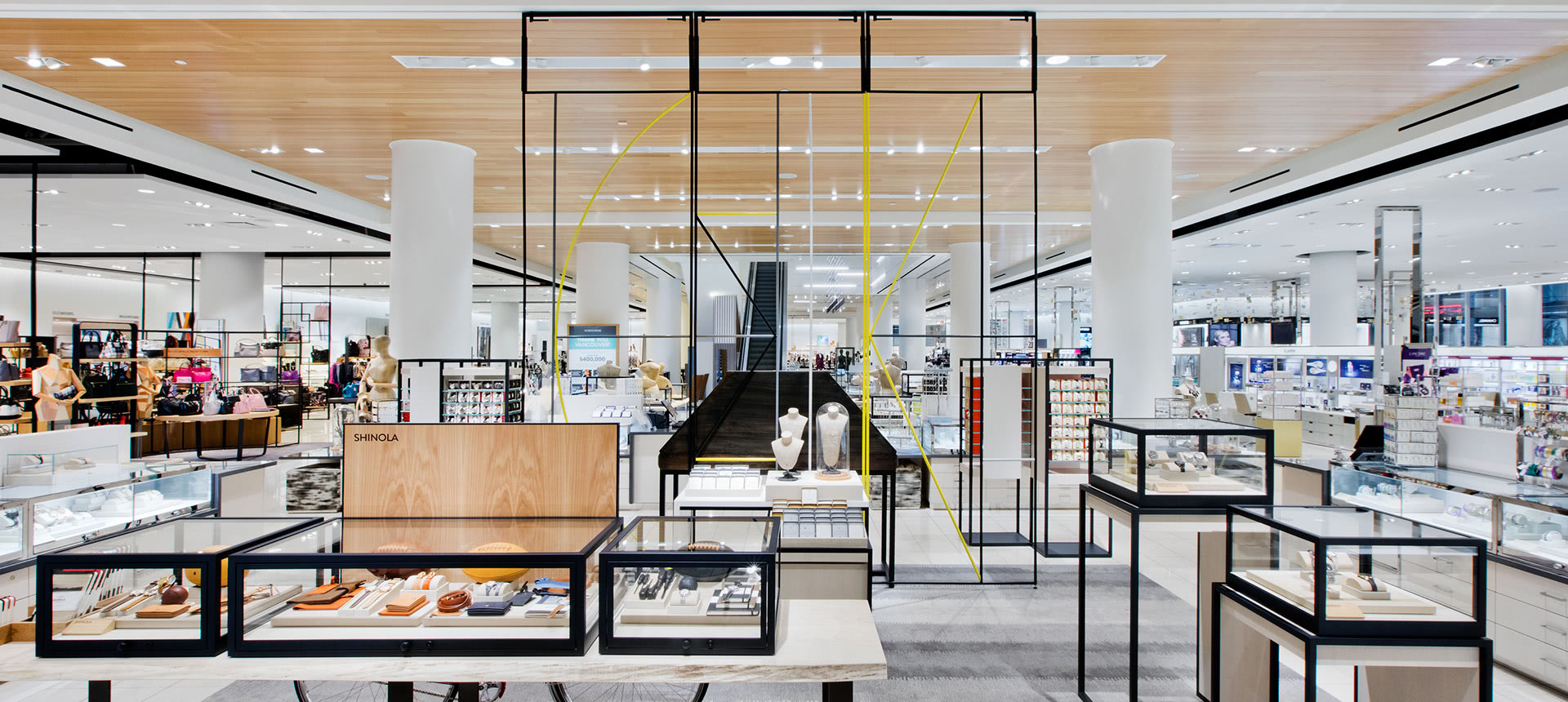
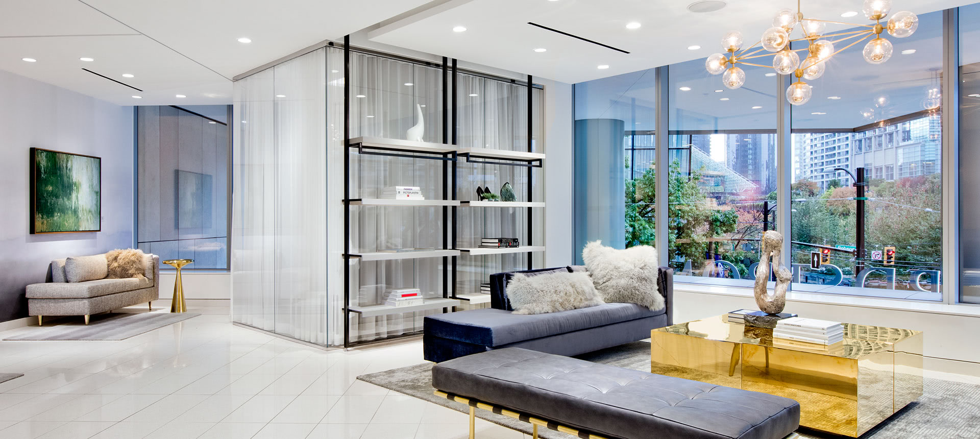
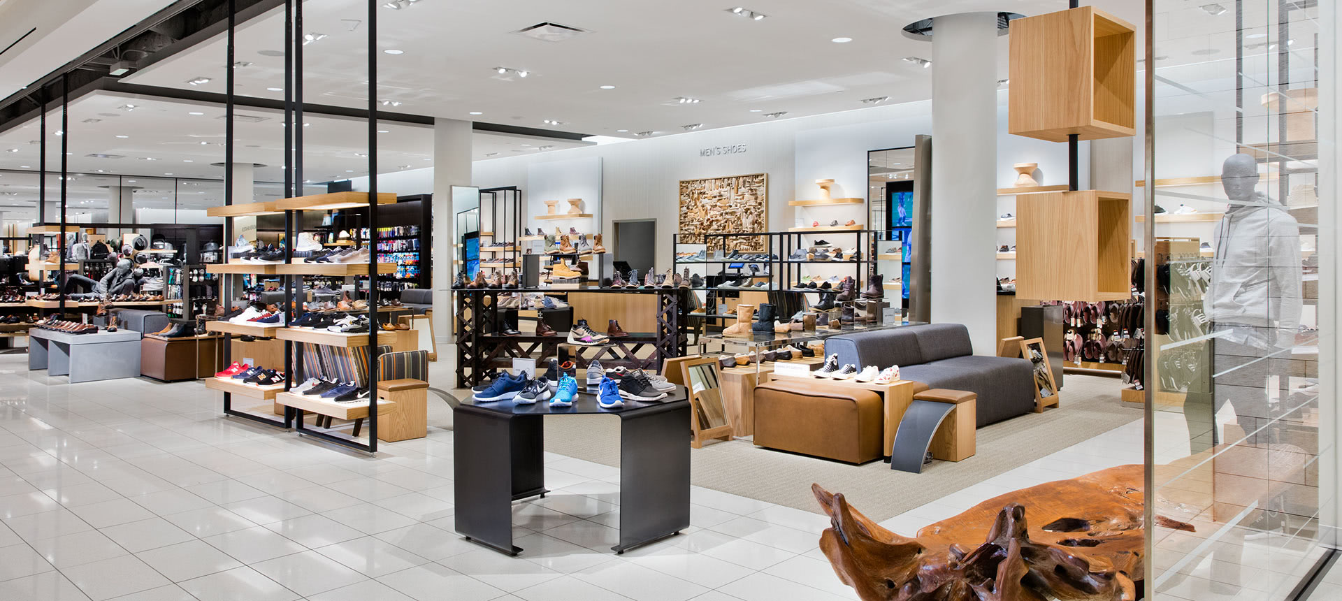
Nordstrom in Vancouver is good example of visual merchandising. Photos: Callison RKF
THE VM ENGINE
New store openings are the greatest proof of how productive a strong visual merchandising engine is. While the whole shopping space and product placement can be perfectly planned out and executed, it will all go to waste without an ongoing plan. This becomes clear after the first sales rush that hits the store, destroying the initial impeccable presentation. This only gets worse with each new delivery, in the hands of untrained staff members.
Investing in training staff on the visual merchandising standards ensures that maintaining the presentation will be feasible. Without understanding what visual merchandising is or does, the same window display and in-store merchandising may remain static for far too long. Consumers will not have a reason to return to the store, if the store is implying that there is nothing new to see. A regulated VM engine means running the mandatory merchandising cycle of revamping and refreshing, both based on product turnover, as well as calendar cycles.
These common faux pas are not new to the modern retail world, however they create a competitive disadvantage. Rectifying each of these common visual merchandising sore points is crucial to lifting the barriers to success.
After 15+ years of industry experience with various retailers and environments such as Holt Renfrew and Adidas Group Canada, VM ID Inc. was founded by Ani Nersessian to help retailers get set-up with a VM culture that is right for them.
VM ID Inc. is a Visual Merchandising service company which provides catered support for small businesses through consulting, designing and labour services. Email: ani@vm-id.com




![Retail-insider-NRIG-banner-300-x-300-V01-3[2].jpg](https://images.squarespace-cdn.com/content/v1/529fc0c0e4b088b079c3fb6d/1593476525034-QRWBY8JUPUYFUKJD2X9Z/Retail-insider-NRIG-banner-300-x-300-V01-3%5B2%5D.jpg)
![Retail-insider-NRIG-banner-300-x-300-V01-2[2].jpg](https://images.squarespace-cdn.com/content/v1/529fc0c0e4b088b079c3fb6d/1593476491497-W6OZKVGCJATXESC9EZ0O/Retail-insider-NRIG-banner-300-x-300-V01-2%5B2%5D.jpg)
![Retail-insider-NRIG-banner-300-x-300-V01-4[2].jpg](https://images.squarespace-cdn.com/content/v1/529fc0c0e4b088b079c3fb6d/1593476508900-TJG5SNQ294YNOCK6X8OW/Retail-insider-NRIG-banner-300-x-300-V01-4%5B2%5D.jpg)